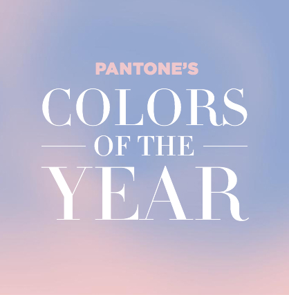
Discover Pantone’s Colors of the Year for 2016
Introducing Rose Quartz and Serenity
For the first time ever, Pantone has introduced two colors blended together to make up the color of the year. Rose Quartz (Pantone 13-1520) and Serenity (Pantone 15-3919) are the winning shades that illustrate the year to come.
The warmth of the rose tone combined with the coolness of tranquil blue evoke a sense of order and peace. Find out how designers recommend you include the colors in your home, and your life.
Bringing the colors home
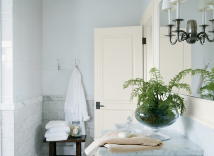
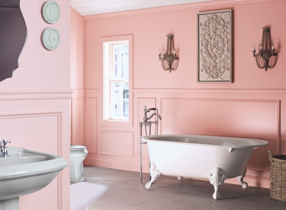
To bring these colors into your home, consider the closest Benjamin Moore shades: Fantasy Pink and Steel Blue, according to Paintzen Design Expert Kristen Chuber.
“The former is a dusty pink, similar to Rose Quartz, and the latter is a misty shade comparative to Serenity. Appropriately named, Serenity is a very soothing color to incorporate at home, particularly in a bedroom or bathroom, as it naturally invokes feelings of relaxation and tranquility,” Chuber said.
Although Serenity is a soft, airy shade, it can pop with life when paired with black. For example, adding black furniture or glossy black frames to a baby blue backdrop creates a sprightly modern look. Benjamin Moore's color of the year, Simply White, which is soft and delicate, makes the perfect canvas for wall art, flowers, or accents in the peaceful Serenity hue, she said.
Warm and playful Rose Quartz can add a refreshing look any room, especially when paired with particular colors.
Pairing beautifully with light grays and silvers (Gray Owl or Smoke Embers), accenting light rose walls with gray furniture instantly adds a sweet, innocent feel to the room. Alternatively, incorporate gold furniture or accents for a more regal look, she said.
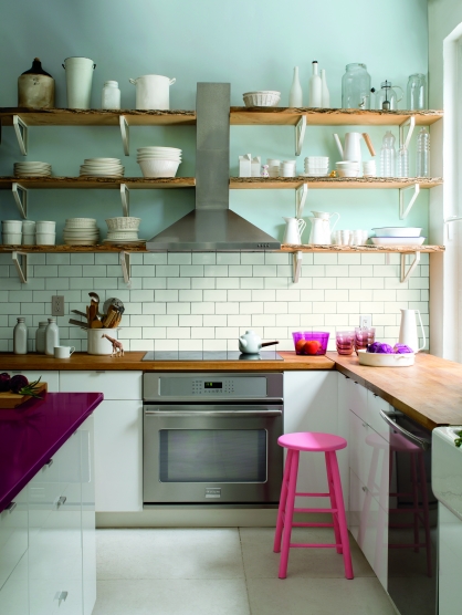
“Combining Rose Quartz with a mint green color (Cool Mint) creates a fun and feminine aesthetic; perfect for a young girl's bedroom.
Brighten up a dull kitchen with Rose Quartz and a citrus color (Limelight) for an overall tropical feeling,” she explained.
“Lastly, when lighting is soft, a light pink hue like Rose Quartz in a bathroom casts a lovely glow on hair and skin. When blended together, the color combination of Rose Quartz and Serenity makes for a lovely faux finish that lends itself to a sweet and light whimsical feel,” she said.
Decorating tips
Chuber said when decorating with a combination of these colors, it’s useful to follow the 60-30-10 rule (60% primary color, 30% secondary color, 10% accent color), as it aids in avoiding an imbalance of color. For example, paint the walls and add a throw rug in your primary color (Ex: Simply White), add a couch and wall art in your secondary color (ex: Steel Blue), and add throw pillows in your accent color (Ex: Fantasy Pink).
“Another unique approach would be painting your front door either color, especially as spring approaches, because a door with one of these harmonious hues will be extra welcoming and will blend with the blooming flowers and blue skies,” she said.
These can also be great shades for repainting old furniture. Whether you are repurposing a wooden crib for a little one on the way or adding a vintage feel to an old dresser or bookshelf, it becomes the accent piece for the room. Painted brick and painted tile are also rising up in popularity; incorporate on a bathroom or kitchen backsplash for a fun, trendy look, she said.
Trends for the year
Gemma Smith, sales director for Strata, a UK homebuilding company, said, “Last year, it was all about bold and bright contrasting colors, however for 2016 we are seeing a complete turn around. This is the year we are stripping it right back for quiet, calming hues throughout the home. From whites through to earthy beiges and calming blues, 2016 is all about tranquility. Muted tones are going to be popular in the Kitchen, with hushed, clean tones of white and grey.”
“Pantone's two colors of the year, Rose Quartz and Serenity, are a contrast of pastels that second this calming color trend for 2016. Using these colors in the home bring a level of playfulness yet still keep to the tranquil theme. We suggest to pair the warmth of Rose Quartz with cold, raw materials such as gun metal to give the room an instant update.”
Artist and designer Pablo Solomon said, “Officially the Pantone colors for 2016 are Rose Quartz and Serenity. Pantone sets the stage for decorators, fabric designers, furniture makers, etc. They also have a top ten list of colors for 2016 that tie in well with the major picks. ( usually Pantone only picks one color per year, but picking two this year is sort of a tongue in cheek salute to the elections).”
“As far as how to incorporate the new Pantone colors into an existing color scheme it is important to remember that one does not have to redo complete walls, but can use an accent item here and there. Also, the colors are meant to be guides, not rules. So if you wish to go with one of the endless variations you see at your local paint store, do so,” he said.
“However, as always I counsel that the hottest paint color for 2016 or any other year is your favorite color as long as that color works with your décor,” Solomon said. “And when you just cannot decide on a color, you usually cannot go wrong with a variation of white.”
(All in-article images courtesy of Paintzen.)